nando’s
Paddington, London
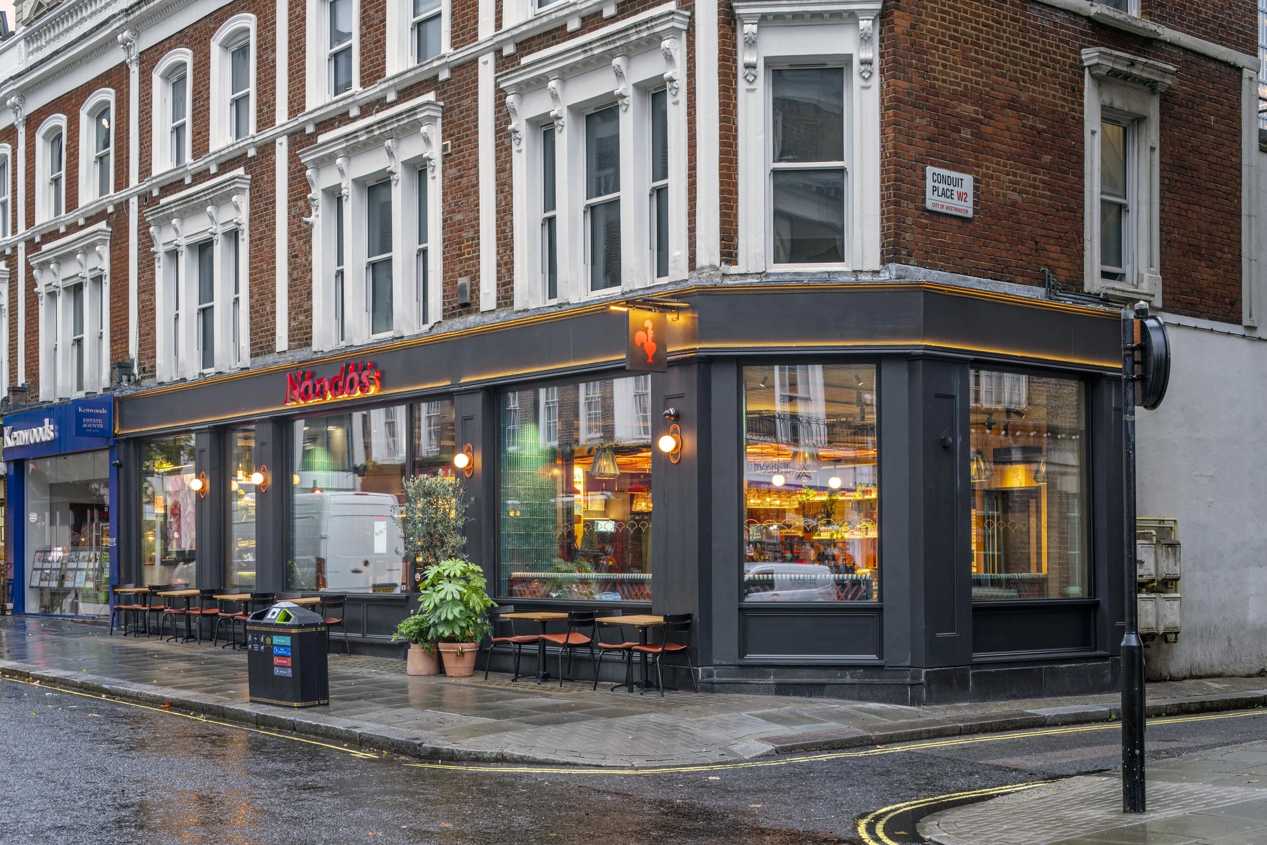
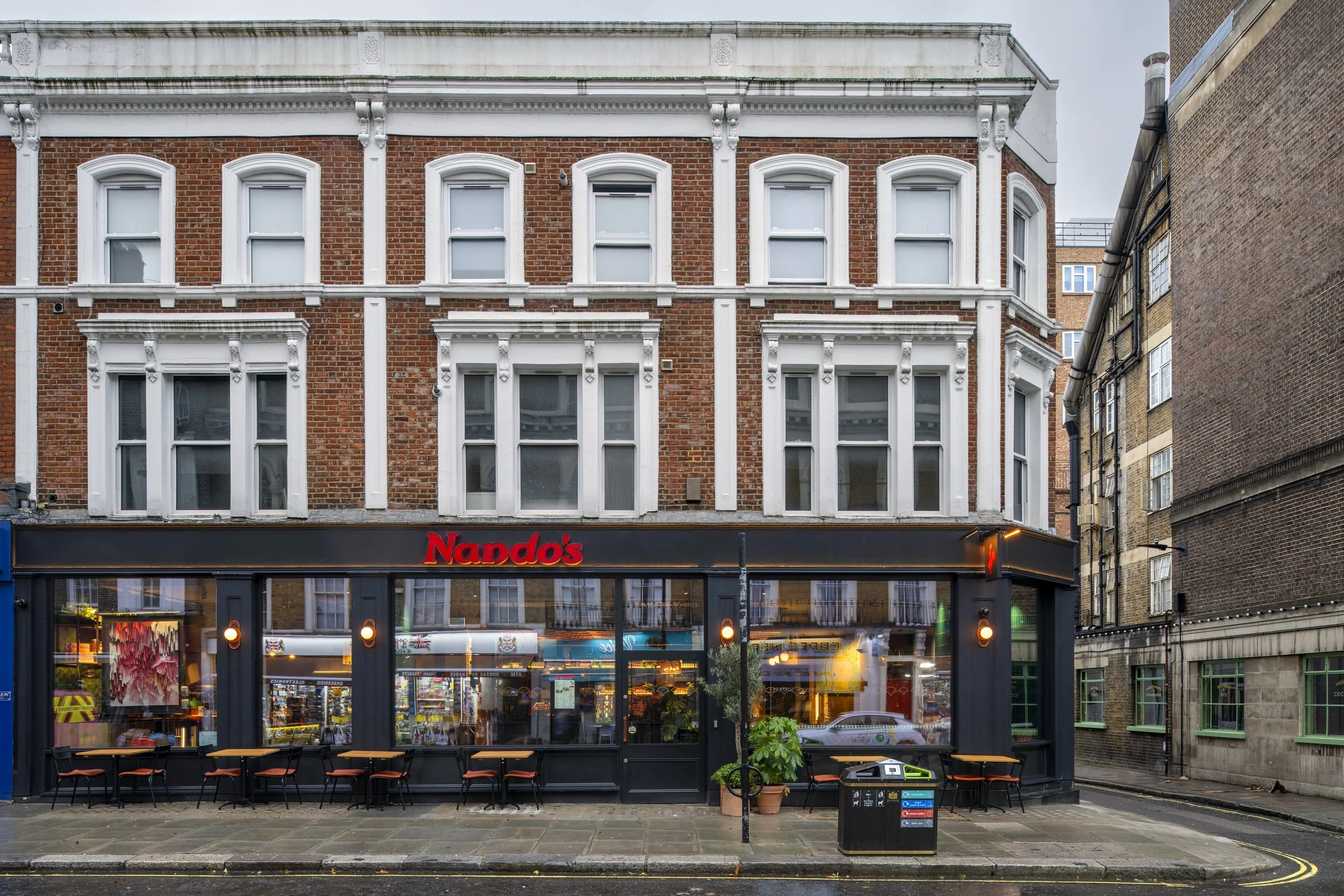
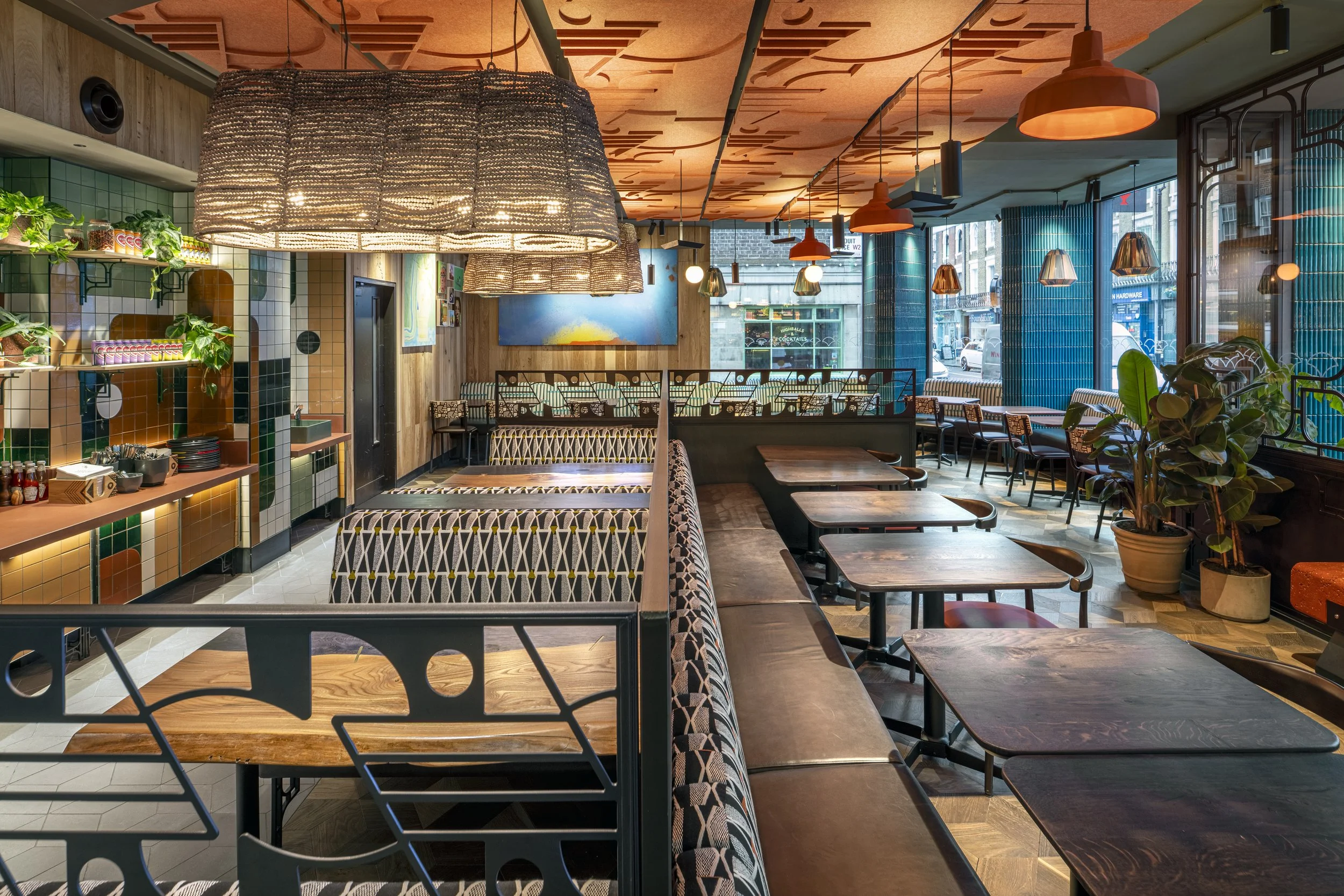
We asked ourselves a question we often pose with these projects: if Nando's did Paddington, what would they do? The answer came from the location itself. Paddington Station is all about brick and ornate metalwork-late Georgian and early Victorian craftsmanship in cast iron shopfronts and decorative detailing.
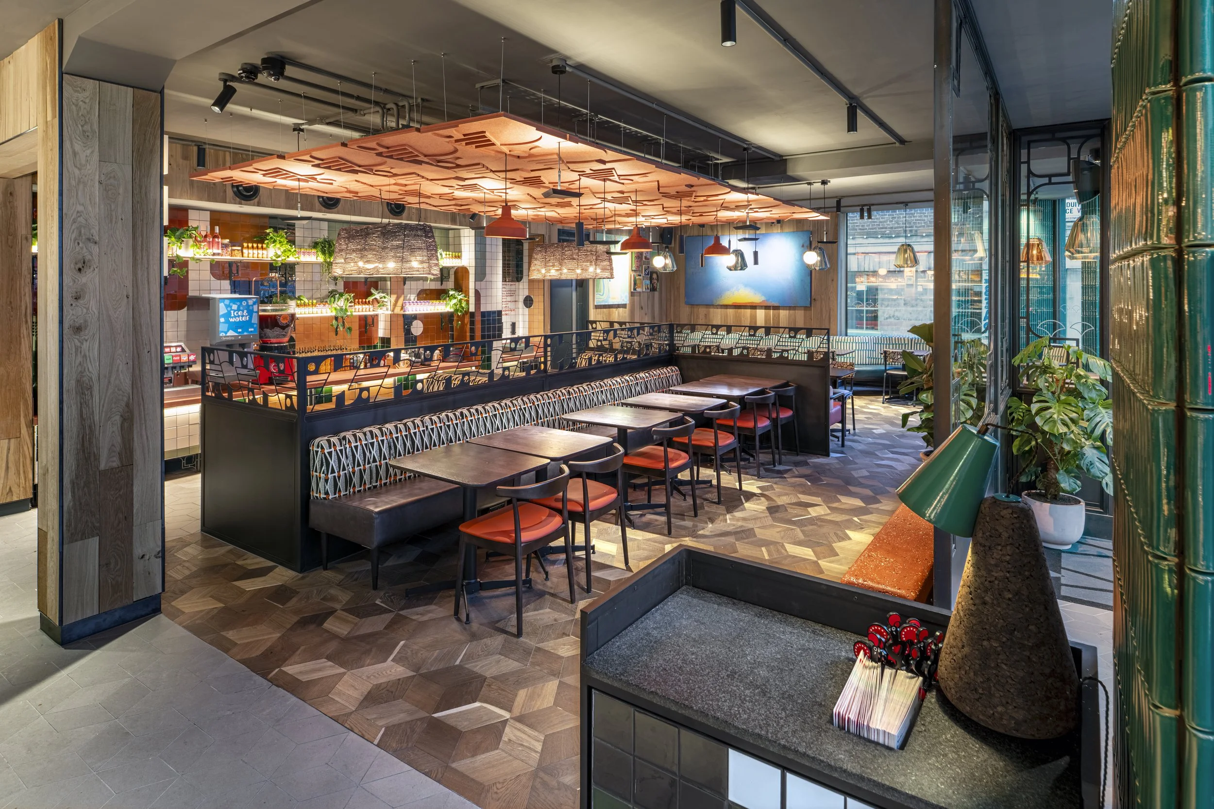
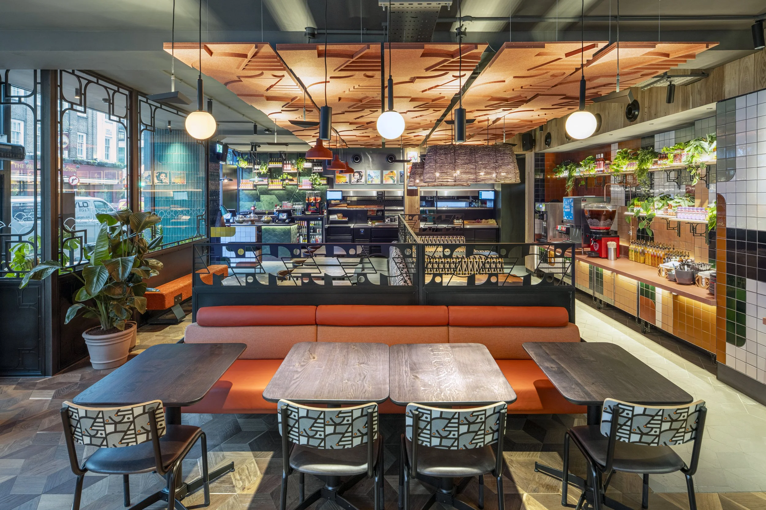
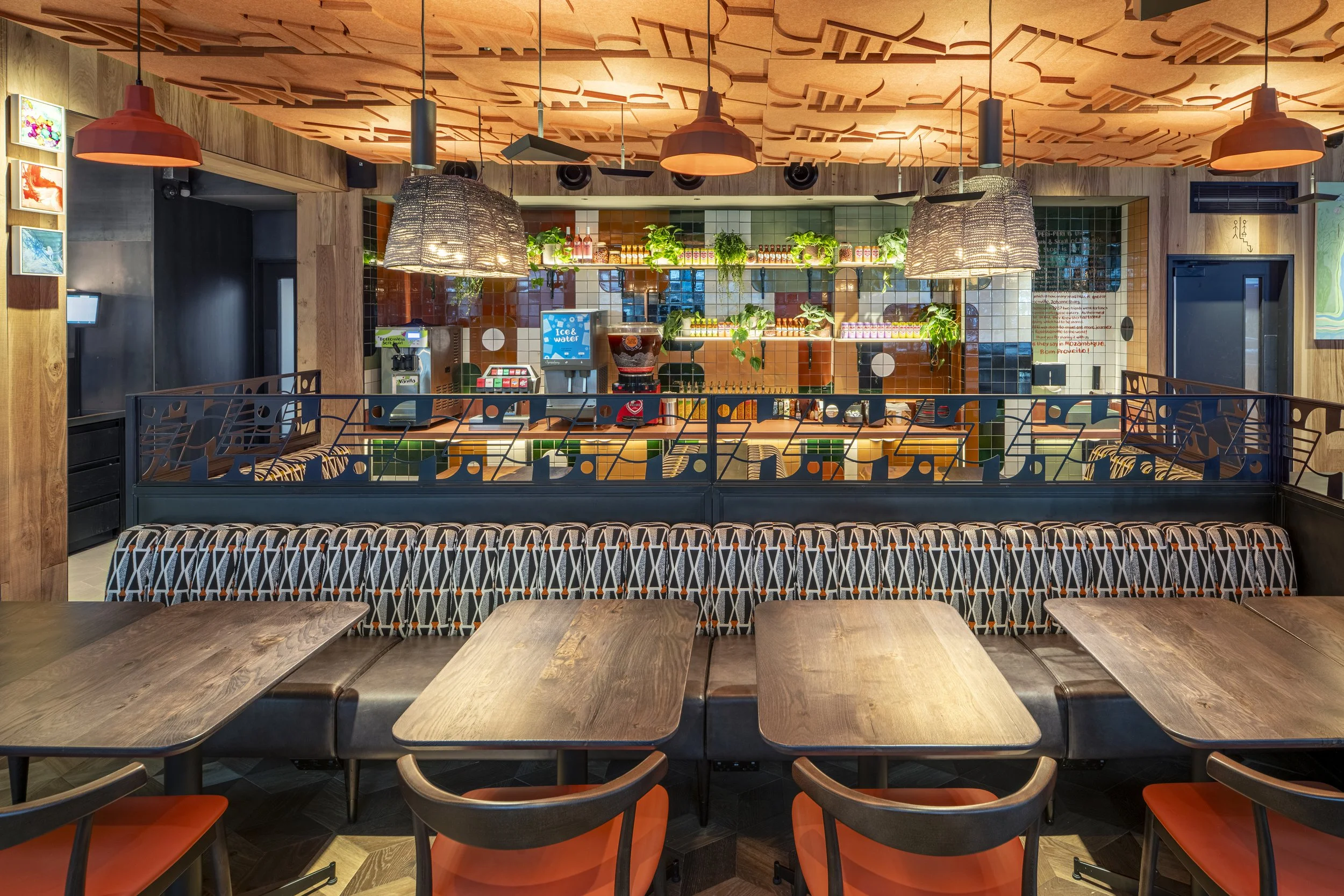
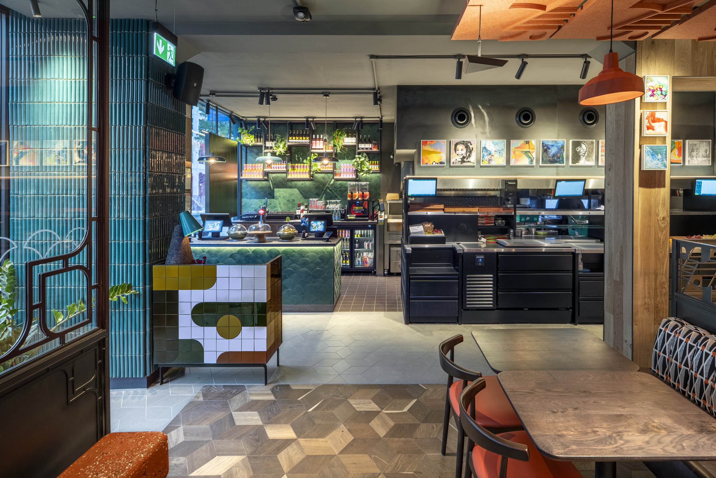
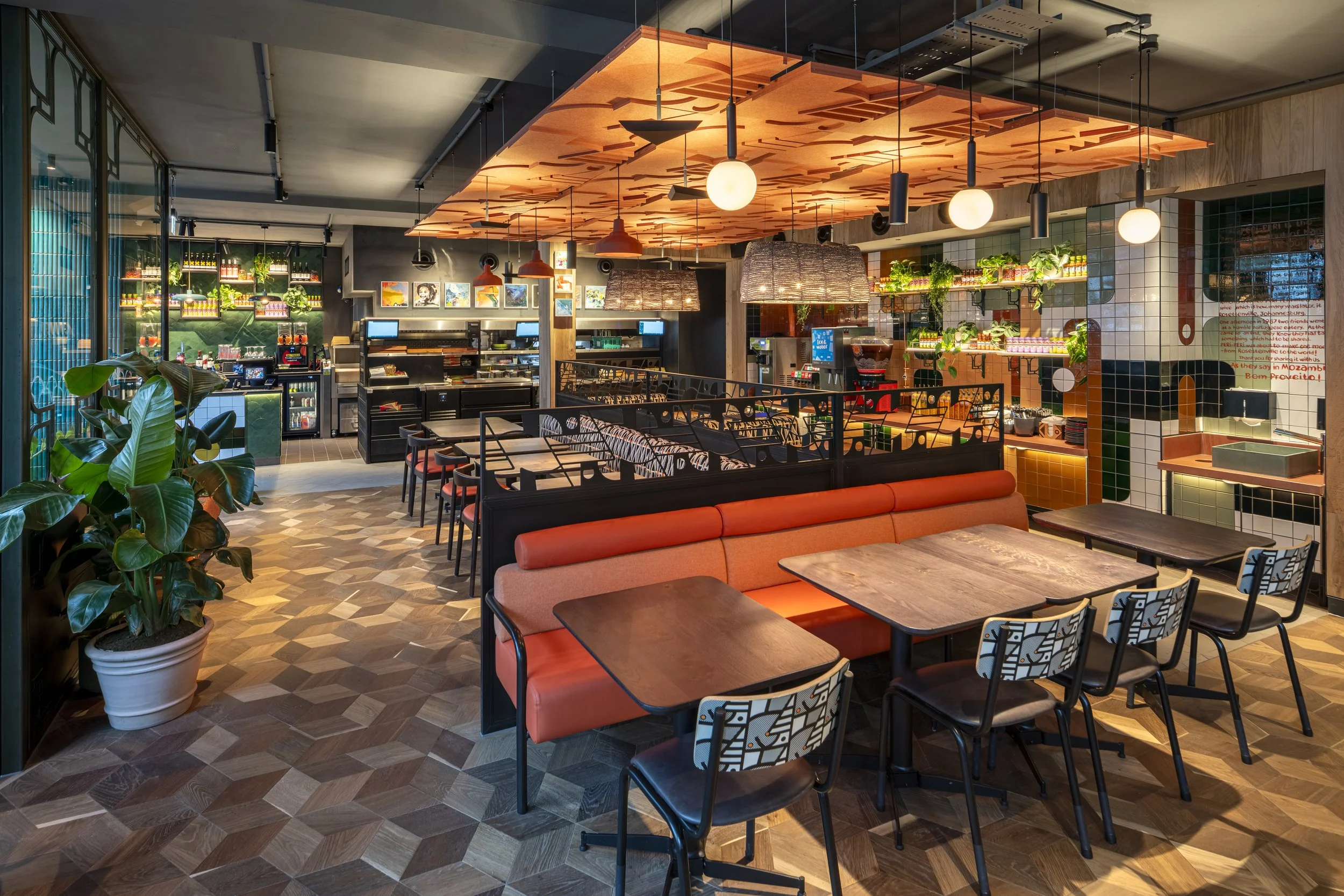
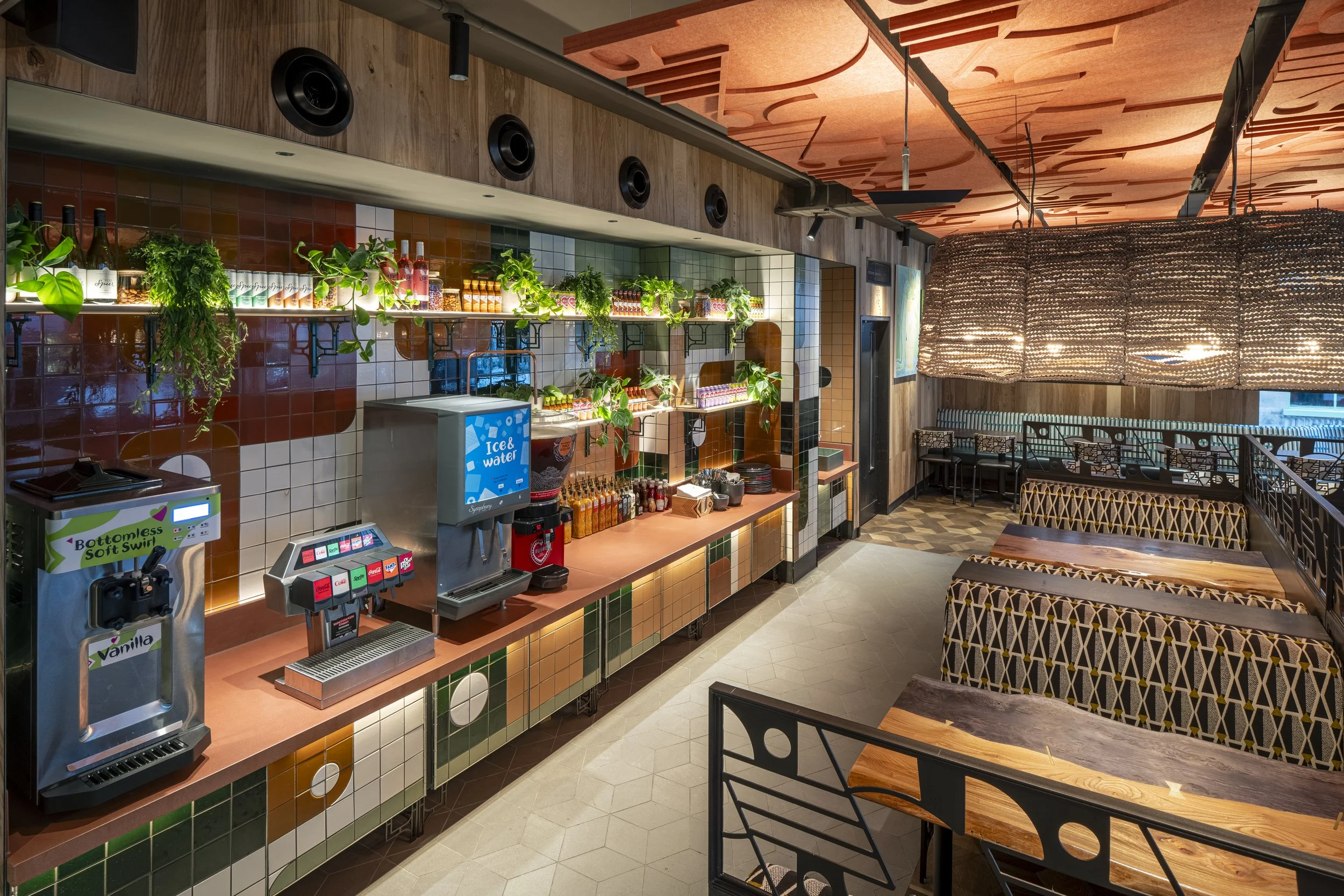
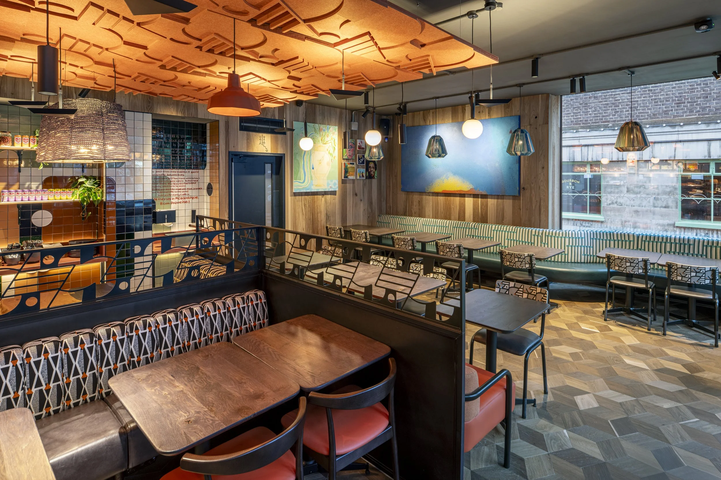
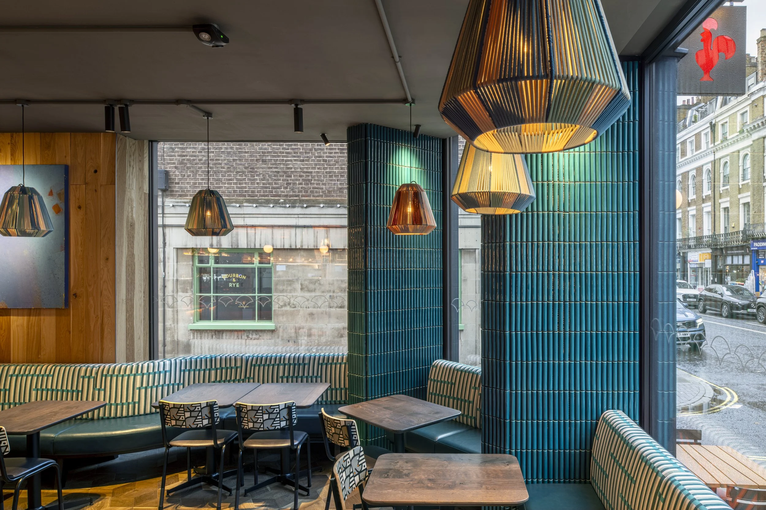
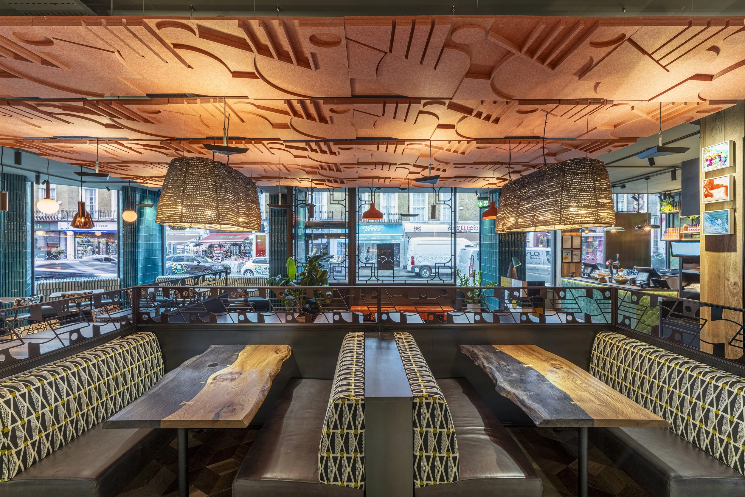
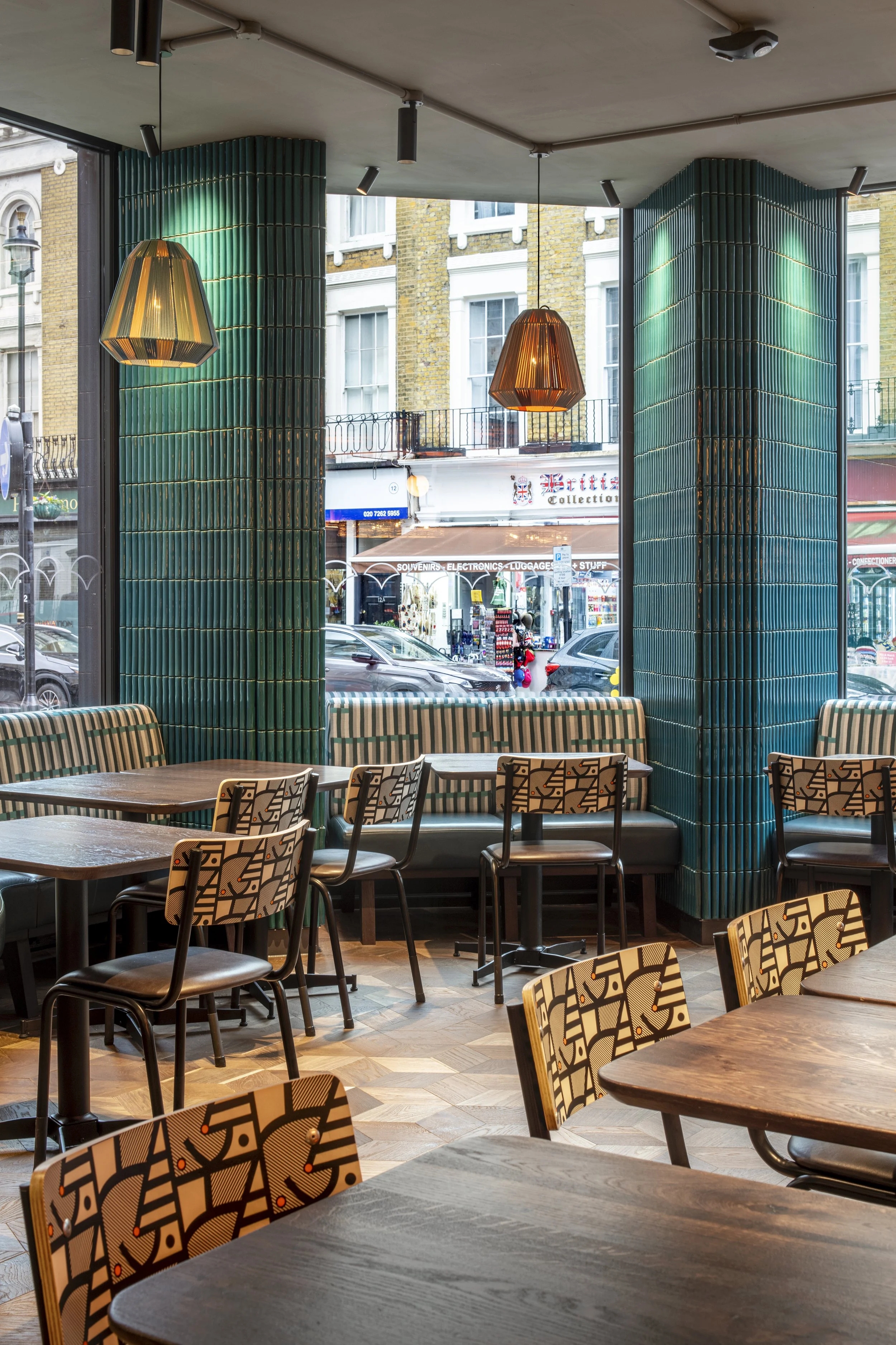
We translated this into two design threads. First, we collaborated with a specialist maker from South Africa known for intricate tiling patterns, bringing terracotta and baked earth into conversation with Paddington's brick heritage. Second, we reinterpreted the area's decorative metalwork, the shapes and flourishes of the station and surrounding shopfronts, into screens, shopfront details, and fixtures throughout the restaurant.
These background stories don't need to shout for attention, but they give the design cohesiveness. The result is a space with an understated shopfront that rewards closer inspection, revealing beautiful detailing around windows and an interior with a light elegance that feels necessary for such a compact space.
Nando's had been trying to secure a Paddington site for years. When a former bank on Spring Street became available, the landlord's message was simple: take it or leave it. The catch? This wasn't an ideal empty box waiting to become a restaurant. This was a 50-cover space (half the size of a typical Nando's) that needed to accommodate the same full operational requirements - same kitchen, same cook lines, same equipment, but in half the footprint.
The building came with all the challenges you'd expect from a converted bank: old vaults that couldn't be removed, access issues for wheelchair users and fire escape, residents upstairs with narrow staircases, changes in street level, and an incredibly tight rear courtyard for services. The site's importance to Nando's was such that they were willing to work within these constraints rather than wait for something better.
Size was the defining challenge. In such a tight site, everything had to be incredibly refined - you can't afford clutter or mess when every square metre matters. Fire strategy, means of escape, and access requirements all had to be solved without compromising the seating capacity that made the restaurant viable.
Planning proved difficult. The conservation officer's expectations went beyond policy requirements, requesting not just preservation of the conservation area but a return to some idealised historical state. The shopfront design became a particular battle, requiring careful negotiation to deliver something that respected the context while remaining distinctly contemporary.
Then there was the vault, the level changes, the coordination of contractors in a space barely large enough to swing a cat. We started with a recently closed bank - chairs, tables, paperwork still in place—and had to first strip it back before building it up again. The upside was having control over structural alterations rather than inheriting a compromised shell.
This became another flagship site for Nando's, one of those projects where the client makes clear they want something absolutely knockout. According to their internal scoring system (which rarely awards perfect marks because "what would you aim for?"), Paddington scored exceptionally high.
For us, it reinforced something fundamental: good design can be as much about curation as creation. Bringing together incredible makers and craftspeople from different parts of the world, then weaving their work into a cohesive whole, can be more innovative and energising than trying to be the creative force behind every decision. You're not constrained by the contents of your own mind.
The project also advanced our approach to visualisation, developing more photorealistic modelling systems that bridge the gap between what looks attractive on paper and what can actually be built - a harder balance than it sounds.
Most importantly, it's a story about elevating what was essentially a tired bank on a fairly basic street (one nice pub, not much else) into something that connects back to the street, opens up to the neighbourhood, and demonstrates that exceptional design quality doesn't require vast spaces or unlimited budgets. Sometimes the tightest constraints produce the most refined results.
From the owners:
“Designing with MorenoMasey is a partnership, they take the time to fully appreciate your values, needs and importantly for us, brand. They are of course innovative and creative, but they listen and ask all the right questions to truly embrace the project at hand. They do a beautiful job of blending your practical requirements and their architectural skill to deliver award winning spaces.”